
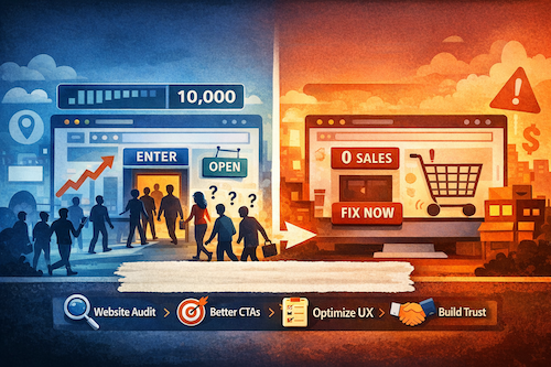
It’s a frustrating cycle: You check your analytics, see the visitor count climbing, and feel a momentary surge of excitement. But then you look at your inbox or your sales report, and… nothing.
If you have plenty of traffic but very few customers to show for it, I want you to know you’re not alone. This is one of the most common hurdles in digital marketing. Usually, the problem isn’t that you need more people; it’s that there’s a disconnect between the moment someone lands on your page and the moment they’re supposed to take action.
We always advise clients to think of their websites like a physical storefront. If people are walking in the door but walking right back out without saying a word, then it’s not a larger business sign that’s needed. We need to figure out what’s happening inside of the shop!
In the world of conversion rate optimization (CRO), we call these "leaks." Here is how to diagnose what needs to be fixed, and how to bridge the gap between high traffic and real revenue.
Why do visitors leave my website so fast?
Most visitors decide whether to stay or leave in about five seconds. Let’s take the example of a physical storefront again, if people can't tell what you sell at a glance, they'll just keep walking. Your website is no different. Visitors are impatient and will leave in seconds if they have to work to understand what you do. This confusion is often the biggest reason your traffic isn't turning into leads.
The Strategy: Run a 5-Second Test. Ask someone unfamiliar with your business to look at your homepage for five seconds, then close the laptop. Ask them:
- What does this website offer?
- Who is it for?
- What am I supposed to do next?
The Fix: Swap "clever" for "clear." Many owners use headlines like "Reimagining Your Tomorrow." It sounds nice, but it tells the visitor nothing. Instead, your main headline should state exactly what you do and for whom. A bakery’s headline should be…
- Instead of: "Baking Memories, One Slice at a Time."
- Try: "Custom Birthday Cakes & Fresh Sourdough in Downtown Springfield."
A visitor who instantly understands "what's in it for me?" is far more likely to stick around. But even if your message is clear, you might still be leaving them hanging if you haven't told them what you want them to do.
How do I write a call to action that actually works?
Once a visitor understands what you do, they need a clear, obvious path. Leaving this to chance is like a store clerk pointing vaguely and saying, "The stuff you need is… around here somewhere."
The Strategy: This clear pathway is created with a Call to Action (CTA). Avoid generic "Submit" or "Learn More" buttons. "Submit" sounds like a chore, and "Learn More" is a vague promise of more reading.
The Fix: Use action-oriented language that promises a benefit. The best calls to action are specific- Instead of asking visitors to “Submit,” you are inviting them to get something valuable. Look at your own buttons and see if you can make a simple switch for a big impact.
- Instead of: Submit → Try: Get Your Free Quote
- Instead of: Learn More → Try: See Our Plans & Pricing
- Instead of: Click Here → Try: Download My Free Checklist
Notice how the new versions are more confident and tell the user exactly what they’ll receive? By making your CTA a clear and valuable invitation, you make it far easier for people to say “yes.”
How can I make my website look more trustworthy?
A polished site is a great start, but it doesn't automatically earn a visitor's confidence. They are silently asking: "Is this a real, legitimate business? Can I trust them?". To get them to convert, you have to prove the answer is yes by using Trust Signals.
The Strategy: You need Social Proof. The single most powerful trust signal is hearing from other happy customers/clients. We are all wired to trust the experiences of our peers more than a company's own claims.
- The Placement: Don’t just hide testimonials on a "Reviews" page. Place a short, genuine quote from a client, ideally with their name- near your "Buy Now" or "Contact Us" button. It provides reassurance at the exact moment a visitor is making a high-friction decision.
- The Human Element: An anonymous website feels risky. Your "About Us" page should feature a warm, professional photo of you or your team. It moves you from a faceless entity to a real person who stands behind their work.
Contact Info: An easy-to-find contact number or email address is a non-negotiable trust signal. If a visitor has to hunt for a way to get in touch, they might assume you don't want to be contacted or that you’re hiding the ability to verify. This is a major red flag!
Why am I getting "junk" leads from my website forms?
If your goal is revenue rather than vanity conversions, then a higher conversion rate isn’t always a win. Cutting every form down to name + email can increase submissions, but it can also flood you with contacts of people who are not a good fit. That slows sales, skews your performance metrics, and weakens your nurturing because everyone gets the same generic follow-up.
The Strategy: You want qualified conversions. This means getting enough information to route and nurture the lead properly without creating so much friction that they give up.
The Fix:
- Conditional Logic: Ask one "trigger" question (e.g., "What is your primary goal?"), then use logic to show only the relevant follow-up questions. This keeps the form feeling short while gathering deep data.
- Multi-Step Forms: Use a 2-step process. Step 1: Capture the intent. Step 2: Ask for the details. This reduces "form fatigue."
- Better Metrics: Stop just tracking the form conversion rate. Start tracking your lead-to-close rate by form version. This tells you which forms are actually bringing in paying customers, not just names.
Keep the questions that create leverage, such as:
- What they need (service type / primary goal)
- Timeline / urgency
- Budget range or investment level (even broad ranges)
- Company size / role (B2B)
- Where they are in the buying process
Is my website mobile-friendly enough to convert?
Over half of your traffic is likely on a mobile device (you can easily verify this by checking your website platform or google analytics). If they have to pinch and zoom to read your text, or if your buttons are too tiny to tap with a thumb, you’ve effectively locked the door on 50% of your audience. What works perfectly on a computer screen can become a frustrating, jumbled mess on a phone.
The Test: Pull out your phone and try to navigate your site.
- Can you read all the text easily without zooming in?
- Can you hit your main CTA button without accidentally clicking a menu link next to it?
The Fix: Simplify. One column, large fonts, and high-contrast buttons. A seamless mobile experience directly increases website conversions because it removes the frustration that causes "bounce" (people leaving immediately).
Making your site effortless to use on a phone is one of the most powerful changes you can make. It shows customers you respect their time, no matter how they find you, and google loves it!
Your Action Plan Audit: Turn More Website Visitors into Customers
You no longer have to stare at your visitor stats and wonder why your phone isn’t ringing. You can now look at your own website through a visitor's eyes, spotting the roadblocks that were previously invisible. The secret isn't about getting more traffic; it’s about clearly guiding the visitors you already have toward the solutions they need.
Don't try to fix everything at once. Use this checklist as your "first-aid kit" and pick one item to update this week:
- Clarity: Does the headline pass the 5-second test?
- Action: Is there a specific, benefit-driven CTA on every page?
- Trust: Are there testimonials located near the "decision" points?
- Friction: Are your forms using conditional logic to stay lean?
- Mobile: Can you navigate the site easily with just your thumb?
You don’t need to be a marketing expert to increase website conversions. Small, thoughtful changes often make the biggest impact.
Let’s bridge the gap between your traffic and your revenue.
Stop guessing and start hitting your actual business objectives.
I’m offering a free 45-minute strategy consultation to help you:
- Unify your tactics so your SEO, social, and website work toward one objective.
- Translate your data into a clear roadmap for better lead quality.
- Identify exactly why your leads aren't turning into paying customers.

Lydia
Lydia Solis is the founder of Her Business Alliance, a fractional CMO and marketing leadership firm that builds psychology-driven marketing strategy for growing businesses. With an MBA and deep expertise in cognitive and behavioral marketing strategy, Lydia works with companies across professional services, construction and trades, beauty and wellness, SaaS and tech, e-commerce, and creative services to connect marketing directly to revenue growth.